Make your site *look* pro with simple CSS techniques

Make your site *look* pro with simple CSS techniques

Big things are created with tiny bits, that’s what I hear them say. It can’t be more correct with web design - a small detail can change the whole site. In this article (and more to come) I will introduce some small CSS techniques that can make your site look pro - I must emphasize the word, since it’s all about visual effects. After all, it’s always the content that matters.

Photograph-like images

Here is what’s *very* often used to make a photo look like a - erm - photo:

And here is the DEAD SIMPLE style applied:

.entry-extended img.shot
{
    background: #fff;
    padding: 6px;
    border: 1px solid #ccc;
}

As you can see, we simply use a white background color, increase the padding value, and add a thin solid border. Change the style a bit to get what you want. Read more »

My icons

My icons

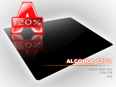
It was 3 years ago - how time flies - when I joined Wincustomize community. I was *very* deep into PC customization that time, especially Object Dock (so ashamed to admit I was using a cracked version of this great application). To make up my dock I was hunting PNG icons all the time, till that day when I decided to do something on my own.

So this was my first attempt - an icon for Alcohol 120%:

Alcohol 120%

Not impressive at all, I know…

Some weeks after I came up with this idea: create a forum thread that accepts requests from people who are in need of a icon for their not-so-well-known application. “Rare Icon Request” thread was born. Though I was too busy to continue my contribution in the thread and had to quit a while ago, the thread is still alive and kicking. Now it’s 3 year old, has 1832 replies in 74 pages, and provided hundreds of high quality icons totally free of charge. I’m happy ;)

Now I’m not making icons anymore, but still I have special sympathy for them…

Here are some icons I made in the good old times. All of my icons were done in Photoshop, with mouse and keyboard - till now I’ve never ever owned a tablet. Read more »

Bad practices (and how to avoid them) in web development

(Yet another post taken from the ruins of Tekaboo)

Whether you are a web designer or a server side guy, there are certain times when you must get your hands dirty with HTML codes. Since HTML is rich, and even getting richer with the coming HTML 5, many HTML coders tend to do it improperly to achieve what could have done differently (and better). This results in many bad habits that should be avoided.

Table designing

tabletrtd.inter.net

No, tables just won’t die (soon), and I’m not insisting them to. They will live happily so long as this internet still has some tabular data to display, or until W3C decides to replace “table” by “chair” which obviously sounds cooler for developers to write.However, for those who are still using tables to align the paragraphs, links, images, and other HTML objects out there, please dust away the cells and begin playing around with CSS design. There are some very good reasons why:

  • Codes with table design are almost totally unreadable compared to CSS design
  • Tables increase your page’s file size significantly in most cases
  • Table design means more work for the browser, especially when you have nested tables (as most of table designers do)
  • Finally, regardless of all those conservative heads out there, with all of its advantages, CSS design is the future of the web. Take a look around, now every design job posted on every freelance site includes this line: MUST BE IN CSS AND NOT TABLES, sometimes with 3 or more exclamation marks (!) following.

So, don’t be easy to yourself. In your next project, begin CSS. Don’t let tables’ “ease of use” prevent you from following the standard. Anyway, who told you that designing using CSS was that difficult to learn? Read more »

FilesTube API

FilesTube API

Yesterday I received this small project to fix a Rapidshare searcher script. They were using an X-request from their server to FilesTube search form, then got the HTML result in a string and explode()‘ed it. Yes, you can tell it was once working like a charm, but not stable at all, since just one small change in FilesTube’s layout can break the code. And it did, really.

Lucky me (and my client), when changing the layout, the nice guys at FilesTube built an API also, as thoroughly technically described here. There’s an example too, and although it looks like a bunch of unmaintained code, it works out of the box. Actually, it does if your server meets these requirements (which I couldn’t find anywhere on FilesTube’s website):

  • It runs PHP 5, which is now the standard PHP version. I believe however, that you can use PHP 4 to achieve the exact result.
  • It has cURL enabled. This is, again, not a problem, since almost every hosting provider has it by default. Yours doesn’t? Well, it’s time to move dude. Being a conservative? You may try file_get_contents() instead.

Read more »

Things I hate on a web page

Things I hate on a web page

(This is one of my article from Tekaboo)

I’m a die-hard web surfer. Internet takes me at least 7-8 hours a day. I read almost everything web: tech and non-tech news, wiki, Google, mythology, game reviews, forum discussion, manga, even pr0n sexy content. After years of web surfing, I’ve come up with a list of things that I really, really HATE to see on a web page. I would almost close the page right away or never come back again if the site I attempt to visit:

1. Disables right clicking and/or text selecting

These are certainly on top of the most stupid Javascript techniques have been “invented”. It’s still a mystery to me why should one need to prevent right clicking on his site, and how effective such a method can be. Right, if you don’t want your precious text and pictures to be copied (read: shared), why bother posting them up? Just keep them to yourself, Mr Ego. Don’t you know that Javascript can be disabled in every browser? Lame.

2. Underlines those non-link texts

Yes, you may call me a picky old man, but believe me, it sucks to click on that underlined text and realize that it’s not a hyperlink at all. It’s almost a standard to reserve underlining for links, and this move against standards is not acceptable (at least, by me).

3. Opens links in a new tab

Or worse, in a new window - yes, even in tabbed browsers. Whenever I click on a link and it pops up a new tab, I go “WTF?” Hey, haven’t I no choice? If I want another tab, I can hold down my Control key and click (or simply middle-click, depending on the mood). There’s no point in trying to act smart reading my mind! And what is it for, that new non-resizable window? Thanks, but no thanks.
Read more »

Six common mistakes in PHP

Six common mistakes in PHP

Okay, so PHP is cool, PHP rocks, PHP is easy to learn… However, just because it’s cool and easy doesn’t mean that you know everything about it. There are gurus (YES!!! LOTS OF THEM!!!) and then there are newbies (WHOHOO!!! Why am I so exciting?). As a guru, you know do-and-don’ts. But what if you’re new to PHP? Don’t panic. Here is a list of top six mistakes in PHP (when I say “top” I mean the “most common” things) that I’ve set out based on my own blood-(not-really)-and-sweat experience.

1. No or little understanding about HTTP methods

What’s the point here?

Everybody uses form, but not everybody knows what “GET” and “POST” really do. As a result, many PHP developers tend to get user’s input data from $_REQUEST, thinking “oh, whatever you send, I’ll catch ‘em all”. That’s not so good, really. Think about $_REQUEST as a merge between $_GET and $_POST, now instead of posting through a form, a user can just attach his (malicious) data via the query string, press Enter, and you’re doomed.

How to fix?

You should spent some extra time to learn what GET and POST are, and what they’re doing with the web (well then, after some careful studying you may find that it’s not really secure using POST, since a medium user can easily fake POST data too, but it’s a different story).

Also note that sometimes PHP’s $_GET and $_POST don’t contain any of the input data. This likely happens in a server-to-server data transfer, and now you must parse the raw data yourself, instead of relying on PHP parser. Something like $data = file_get_contents(’php://input’); if you’re ready with that.
Read more »